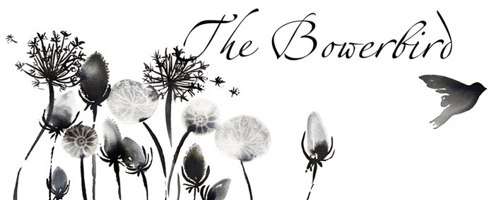
The current Lucy King Design image is fine for freelance work - but for product branding it is a bit plain and impersonal don't you think?.....
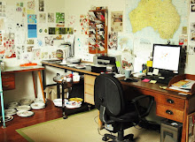
I've got no idea if I will ever be able to develop my own product range, it's been something I've wanted to do for a while but I can't ever seem to get passed the idea stage. I have lots if ideas, but find the whole notion of dealing with manufacturers and having to sell my own products quite daunting!
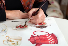
I started off by quickly sketching a few ideas on paper and then progressed to Illustrator. I looked at different typefaces and whether to go for something hand-written or graphic. I liked the idea of incorporating the crown as a logo as this relates to my surname and also links in with the Me Old China image.... but not really sure if this is working.
I looked at some of the branding that I find appealing - and I'm very much drawn to logotypes. (A logotype is a brand name without the addition of a logo or symbol, so the treatment of the font or colour becomes the actual branding).
I like branding styles that are classic and sophisticated, but that are also simple and not too formal. I'd really like to try and achieve a look that is smart - but also has some personality and isn't too formal. It's been very hard to find a good balance of all of these elements and create a look that I think suits me and my work.
So this is what I've got so far..... I've narrowed it down to 3 main fonts that I like, and have started to explore subtle differences with the introduction of italics, upper and lower case, and incorporating grey as well as black.
What do you think?.... I'd be keen to get peoples feedback on any likes / dislikes to the above. I'm not a graphic designer so it's not my area of expertise - feel free to be honest as I have no-one to share my ideas with here and I'm struggling to get any perspective on the designs.
Whilst I was expoloring different typefaces I found a few great font websites which I thought I'd share... The first is Logo Design Love which has some great logo examples and design resources, Fontscape which is a font directory with typefaces handily categorised and also ables you compre many different typefaces on the same page (very handy!) and lastly My Fonts which allows you to type in a word and then see it across all the different font types. They also have great categories to search such as retro, modern, 1930's, antique etc. It's fun!


Such a tricky process! I admire the Paul Smith and Orla Kiely logos - I guess it is the hand-written component that appeals. Therefore I think your hand drawn design that looks a little bit 1930's ish is lovely, that is the design at the top of your post! Design no. 5 is also a winner. Good luck!
ReplyDeleteHi Lucy
ReplyDeleteIt's such a tought decision! I really like the crown in the logo as there is a real link to your surname! The top right corner logo of Lucy King Design with the crown appeals to me as it states 'design' the word, 'design' is in a lighter colour & it has the crown. It also looks like an old fashined stamp.
I do like your own cursive signature as it's personal; & it reflects an arty tone & that your work is by hand painting/ drawing, not just a computer- generated image.
All the best!
I like the first logo at the top but would suggest the crown is not hand drawn but is the standard crown. This will form a contrast and give emphesis to the free style hand lettering underneath making it look more distinctive. Perhaps you could put the word DESIGN underneath your name much smaller in caps in a sans serif type face with spaced out lettering but not going the full width of your name. Again, this will add emphasis to the name style and link up with the finished crown at the top which should form a pleasing unit. It might be worth a try. Hope this does not add to your confusion. Tom King
ReplyDelete